by James Wallace Harris, Saturday, July 22, 2017
[I’m going to show screenshots of my computer’s desktop to illustrate using a computer monitor as an art gallery. The image in WordPress will be small. You won’t see the wonderful details I see on a 28″ screen. If you right-click an image and save it, you should be able to see it full-size on your computer.]
My new hobby is collecting digital scans of covers from science fiction books and magazines. It’s a minor hobby that I find pleasing to my mind and memories. Back in the 1970s, I and some of my science fiction buddies enjoyed taking 35mm photographs of covers using a macro lens and then showing these cover collections as a slideshow at the science fiction club meetings. People were always blown away when they saw the art blown up.
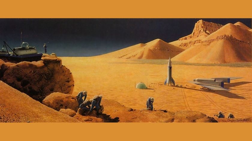
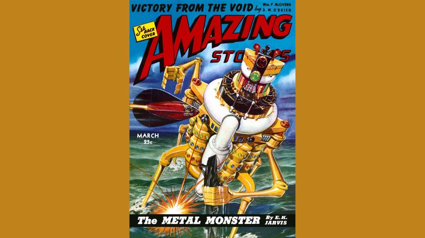
A picture, we have always been told, can convey a thousand words. If you study cover art for magazines and books you might discover that’s conservatively true. Artists visualize details for science fiction stories I never do in my mind while reading. Often the artist will put more details for a story into his artwork than even the author imagined in words. I love that. For example, what’s going on here? I’ve never imagined such a wild colorful machine in my head.

With the advent of flatbed scanners, computer monitors, and even large screen TVs, it’s possible to create similar slideshows to my 1970s Kodachrome slideshows. And I’m not alone in collecting digital art. For example, there’s a company called Klio that produces handcrafted digital picture frames with 4K monitors just for showing fine digital art. There’s already tremendous interest in 4K wallpapers. It’s also fun to collect hi-rez JPL, NASA, and other astronomy images. So collecting imagines of science fiction book and magazine covers isn’t that strange. There are several groups on Facebook that love SF pulp covers. One of my favorites is Space Opera Pulp.
The problem I face is getting good scans. There are many places on the internet to find a collection of covers, but often they are small images or poorly scanned images. My 4K monitor has a resolution of 3840 x 2160 pixels, or roughly 8.3 megapixels in a 16:9 aspect ratio. In the future, we might have 8K monitors (7680 x 4320 – 33.2 megapixels). 3840 x 2160 is smaller than what many digital cameras and smartphones currently snap at maximum, but it’s a good deal larger than the standard computer monitor or HDTVs, which has a 1920 x 1080 resolution. Getting larger scans dramatically improves the visual impact of displaying digital art.
Most people want to use small images on the web to improve download times, and I understand that. But for us collectors, having larger scans is better.
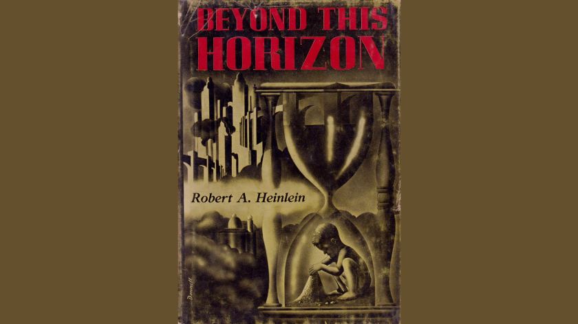
I find the best scans are those I do myself. I’ll scan at 300 dpi. Here’s a 1550 x 2265 scan of Beyond This Horizon by Robert A. Heinlein. It looks great on my 4K monitor. The wear on the paper is visible, yet the details of the cover are wonderful.
Here is a scan of the original Astounding magazine that first published Beyond This Horizon. It is only 400 x 550. It’s okay, but I wish it was at least 800 x 1100 or larger. By comparing the two, not only do we see how scanning resolution effects the presentation, but we also see how the condition of the book/magazine also determines what we will see. Also, isn’t it fascinating to see how two different artists captured the world Heinlein imagined?

I must warn people who are considering buying a 4K monitor that there are drawbacks, especially for Windows 10 and Linux. Everything looks tiny when Windows is set to native display on a 4K monitor. You have to use custom scaling to get things to look right, and even then, not all apps cooperate. Usually, I scale to 150% or 225% on my 28” monitor. Some programs like Word and Chrome can also scale within their windows. Windows scaling to 225% help for getting around within Windows. 150% is much nicer for working with photographs and images.
Generally, the images I find on the web are usually much smaller than my monitor’s display resolution. I use a program called John’s Background Switcher (Win or Mac) to display my digital art collection. It had many options and setting variations for displaying digital images as your computer background. I use “Scale pictures to fit screen” which means I see the whole image without cropping, but it magnifies the image to fit the largest width or height. So portraits have color bars on the right and left, or landscapes have color bars above and below. John’s Background Switcher automatically selects the colors to use to match the image, and nearly always it’s a pleasing match.

Between Windows scaling and John’s Background Switcher scaling, sharpness can take a hit. I find keeping Windows scaling down to 150% makes text barely large enough to read, but greatly improves image sharpness. However, it’s very important to get a good scan to begin with. Sometimes a 600-pixel high image can be much better than a bad 1500 pixel high scan. Here’s a 729 x 530 scan, but all the wonderful details of the artwork are fuzzy. This illustration is so wonderful that I wish I had a full 3840 x 2160 scan. Unless you see this image blown up you can’t appreciate the details the artist provides.

Sometimes I can find a scan of a cover and a copy of the original artwork that was used to make the cover. For example, I have an image Rocket to Nowhere by Lester del Rey (636 x 960) and a copy of the artwork used to make the cover (2484 x 3000). As you can imagine, the copy of the artwork is crystal clear and very dramatic on the 4K monitor. It actually has to be scaled down to fit on the screen. However, because the 636 x 960 scan is so sharp and well made it looks wonderful on the larger screen too.


I’m not sure I can convey the impact of seeing these images on a 28″ 4K monitor via WordPress. Both large screens and high resolutions help make pictures have an impressive impact. Even black and white interior illustrations are greatly enhanced by size. Below is an illustration for one of the short stories from The Martian Chronicles by Ray Bradbury. Is it anything like how you pictured the story?

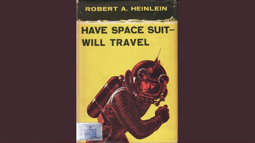
I also love collecting covers from my all-time favorite stories. Seeing them trigger memories of when I first read the stories. Here is the original magazine illustration for Have Space Suit-Will Travel by Robert A. Heinlein, and a scan of my personal copy of the hardback.

Sometimes I can find scans of my favorite books, like Empire Star by Samuel R. Delany, but I’m dissatisfied with the scan. I keep it because it’s the best I’ve got. This makes me wish that people who scan covers think about the future. These books and magazines are deteriorating and fading. Whatever you scan might be the best memory we have of that book in the future. So make sure it’s in focus, the color is well balanced, and you get the most pixels possible. I wish this image was more in focus. It looks fine small, but not enlarged.

Also, here’s a copy of the paperback edition where I first read Stranger in a Strange Land. Because the book itself is beat-up, the scan isn’t quite nice to look at. I keep it for nostalgia sake. I wish I had a better scan.

Old magazines fade. What makes a magazine collectible is its condition, and that can vary greatly. Scanners scan what they have, so I can’t complain. But I wish collectors who have better copies would scan their covers and upload them to share. Here is a bright Amazing and a faded F&SF to show the difference.

I know 99.99% of people don’t care about what happens to old magazines. I just wrote an essay on Jane Austen for the 200th anniversary of her death. Reading about all that existed then that is now lost from 200 years ago makes me understand the importance of preserving the present for the future.
I love finding scans of original artwork used for cover illustrations, like this painting by Richard Powers. It’s a good example of how science fiction art changes styles and vogues over the years. Powers’ artwork sold a lot of science fiction in the 1950s and 1960s.

One reason I love looking at scans of old magazines and paperbacks is that I enjoy how people in the past imagined us folks in the future looking. Here are two paperbacks from the 1950s. The Door Into Summer is 1957 novel about a 1970 man taking cold sleep until the year 2000. I first read it in 1965, and we’ve already lived past the year 2000. I never wore anything that looked like that. Also, look at this cover of Nineteen Eighty-Four. It’s wonderful.


I could write about science fiction cover art forever. I’ve written about SF book covers in the past and will write about them in the future. I never get tired of them. I thought I was probably a very oddball person for liking old SF covers. But some of the groups on Facebook devoted to SF covers have thousands of members.
JWH

They are truly gorgeous! 😀
I like those too. Though the folks on the cover of 1984 are sexier than I pictured.